A B2B Website is the best sales tool for building customer relationships, generating leads, and driving your marketing funnel forward. Unlike B2C websites, where a sale can be expected on a single visit, B2B websites are all about building customer relationships and converting those relationships into sales. This entails multiple interactions across numerous media channels. Therefore, the best B2B website design should inform, educate, charm, and persuade customers to engage with the brand.
B2B Website design with best practices helps with the site visibility and delivers what your customer needs and expects. It also leads to more organic traffic, improve engagement, and SEO, which will convert to potential leads and eventually new business deals. They say the first impression is the last impression. So a high standard of your B2B Website design will lead to better user experience for your visitors. And more often your site will leave a positive, lasting impression on your new customers.
Before you embark on designing your website, it is important to document your B2B Website Strategy. This strategy complements your Business Development Strategy and will help you design the best website exclusively for your business. Here are a few of the websites with top B2B Website designs in 2023. That we think will make you stand out and may help in creating an awesome website for you.
The 8 best B2B Website Designs of 2023 we fell in love with. They efficiently covey who they are, what they do, and whom they do it for. With elegant design and strategically place CTA (Call to Action) buttons.
1. Aston Currency Management – Smooth Interactive Design
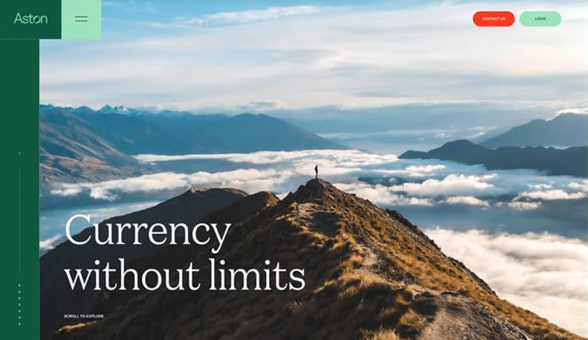
Aston Currency Management is a foreign currency exchange firm based in London.
They use the mouse-sensitive scroll to give users a chronological narrative to follow, moving from one resourceful content to another. While the navigation bar moves along with the journey. The strong imagery and familiar brand color: green creates personable feel for users which is always beneficial for service-based businesses.
Additionally, the combination of Serif typography for the headings and Sans serif for the body adds an elegant professional touch to the mix. To make it one of the great examples of b2b website design.
2. Zendesk – Telling exactly what it does
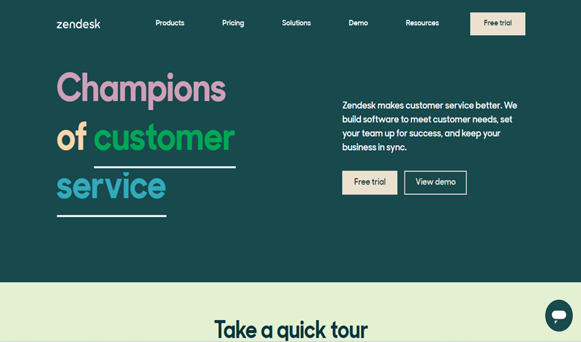
The good people at Zendesk provide hassle-free customers relation services to other businesses and firms. Which they let you know exactly that from the get-go. Their messaging focus on “better customer service” is found on their main page so there is no confusion about what they do.
When the user is clear on what they do, they are inclined to click on perfectly placed CTAs to take them where required. The use of color and text animation utilized at the time this is written, also adds aesthetic and informative value to the mix.
3. Miro – One Main CTA
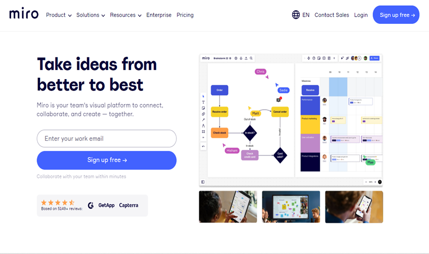
Strategically placed CTAs in the b2b website design can have the greatest impact on converting your leads to sales. If it aligns with your B2B Website Strategy, a single perfectly placed CTA on your homepage can add much value to your business. Like how Miro did with the ‘Sign Up free’ CTA on their website. They used a blue button on a white background to make it stand out from the backdrop.
4. Grammarly – Define Value Proposition
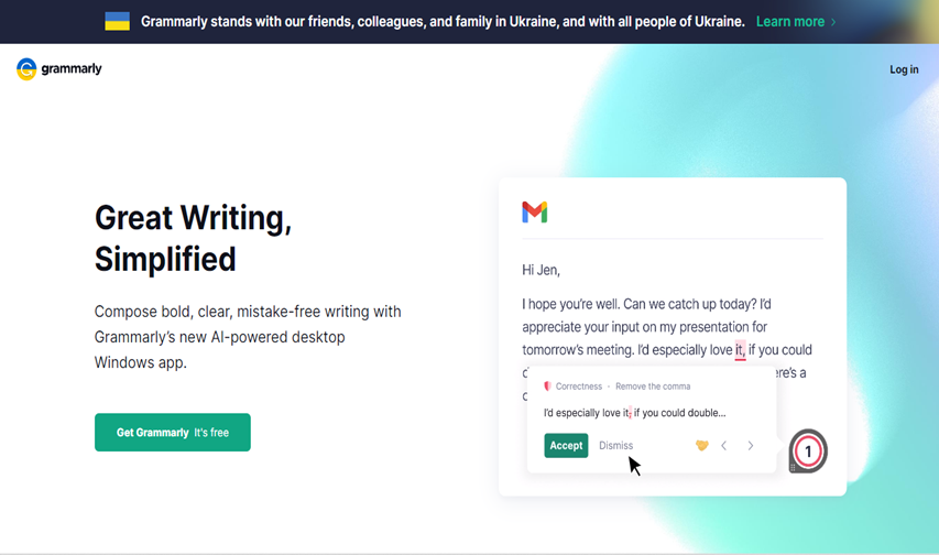
Your clients should instantly identify what value to their business you are offering. Instead of having multiple focal points and being all over the place, focus on a single value proposition that you can offer. Grammarly does this on its homepage and uniformly throughout the site. The Company’s value proposition is clear from the headline at the top of its homepage. The Call-to-Action button makes it clear to the user what they can expect when they click on it.
At the first glance, the user can understand what can they expect from Grammarly and how it can add value to their writing experience. Leading to quicker decisions by users.
5. Acme-World – Practical Minimalism
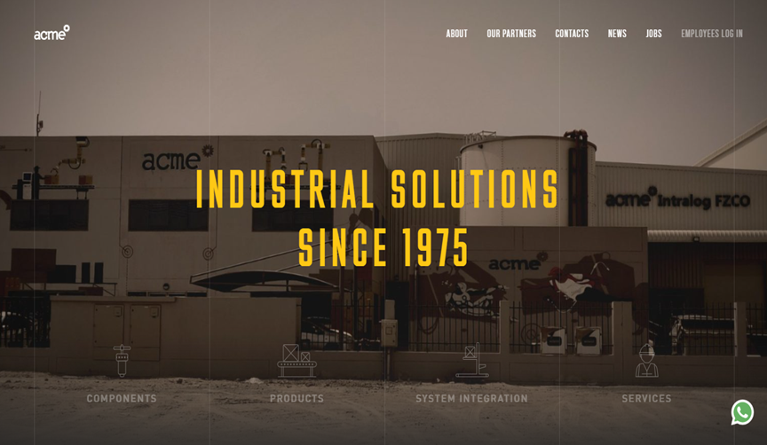
Sometimes less is more. No need for chaos and clutter, a simple minimalistic design including core services is enough to drive the message forward. Acme does the minimalistic approach rather well. Their home page is divided into subtle lines with their services and a simple hover animates and reconstructs the background. The new imagery depicting where the user lands when they click on the service.
Less content on the page means more attention to existing elements, so centered, small, and simple statements in yellow like the ‘Industrial Solutions since 1975’ tagline become more prominent and resonate with the users.
6. Aero Time – Power of Visualization
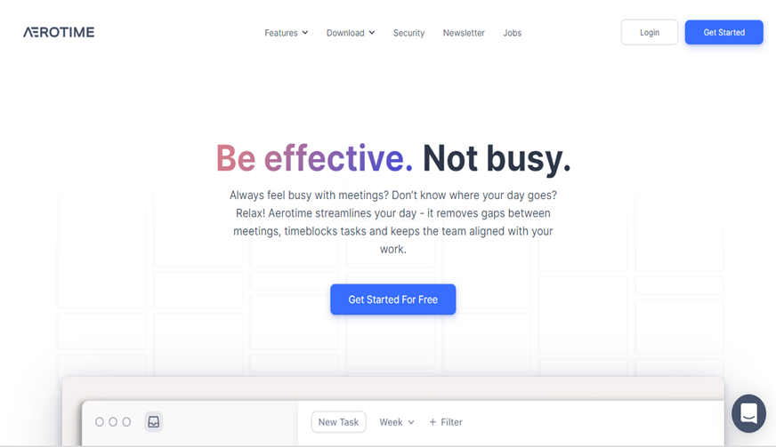
Sometimes animations paint a better picture than words of what benefits and value the firm provides. Aerotime uses stunning animations on its home page to display the expected workflow of its users, so the benefits are instantly clear. The use of parallax animations in different sections, which moves the website layers when the visitor scrolls, is a delight to watch. The scrolling function makes the user journey engaging and enables a strong visual hierarchy, so it is clear where a section begins and ends and where a user can click.
To make sure that the users do not get lost in its brandings and illustrations, they have used bold and colorful typography, links, and emojis for a more personal feel.
7. Dbs Interactive – Have a Case Study Page
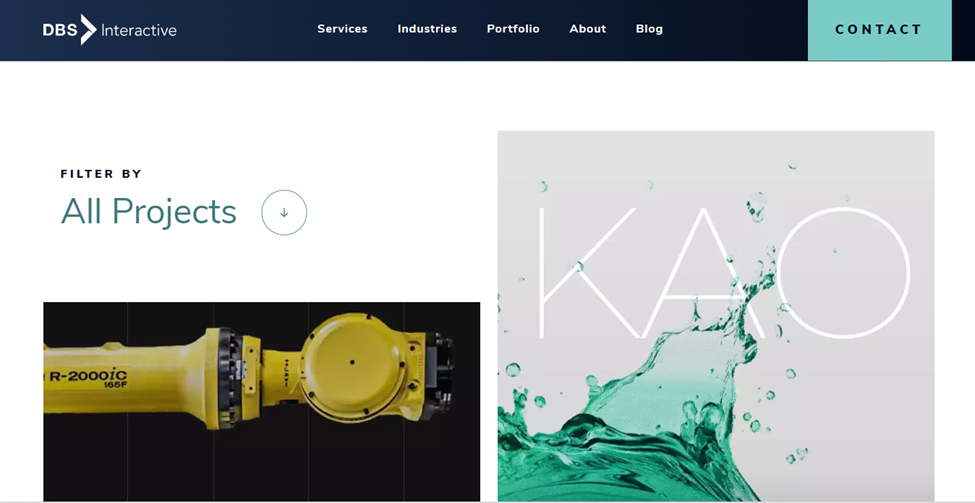
B2B businesses usually have long-term relationships with their clients which involve multiple problem-solving and product management. These interactions become case studies for future clients and are one of the most important features of B2B Website design. Case studies display in detail how you helped your clients achieve results, demonstrating your eligibility and reliability.
Intellum has a dedicated case study page that does exactly that. Each case study is presented as a relatable story in an easy-to-follow format with numbers and statistics. Case studies are social proofs of your company-to-client interactions that address customer objections and depict your problem-solving prowess.
8. Blake Envelop – Emphasize your product
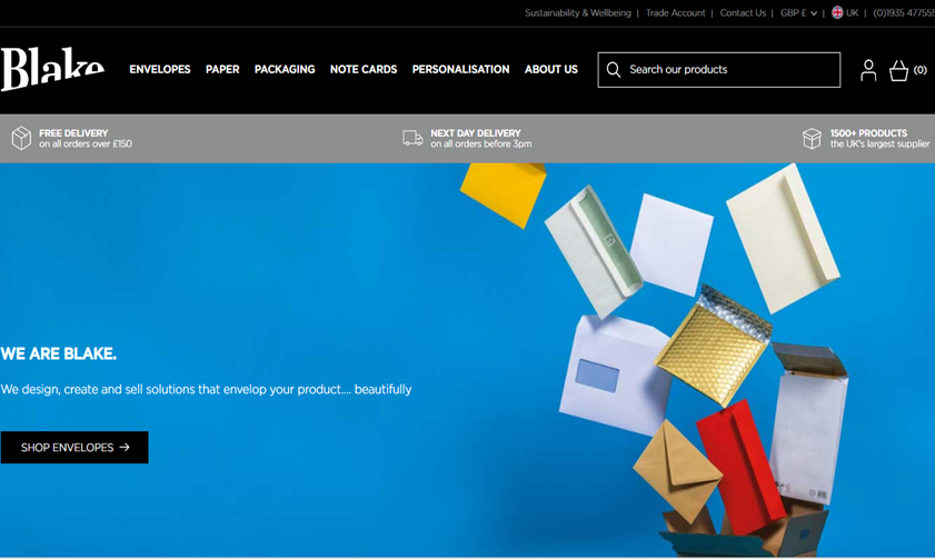
Not many people think of envelopes as interesting, but with vibrant colors and cheery designs, Blake Envelopes capture the visitor’s attention. Along with great site display, by focusing and emphasizing their products and their various categories, the site makes a passive product feel more active and interesting.
The homepage allows the user to find envelopes of all sizes, purposes, and colors along with their extensive product catalog to find exactly what their user needs.
Make your B2B Website Design Stand Out
The right blend of functionality and aesthetics does the job. A stunning and appealing design is of no use if it is poorly developed, has unhelpful content, or is hard to navigate. To really stand out from the rest a blend of beauty and brain is needed.
Follow your B2B Website strategy to write helpful content, create a clear customer journey, and ensure lead generation for your business. Complement this with beauty with visual directions, a great aesthetic design idea, and clear CTAs to guide your users.